TOUGH MUDDER
Workout App
TOUGH MUDDER
Workout App

About the department
The Office of Returning Citizens (ORC) works to support re-entry of people coming out of incarceration. Established in the fall of 2017, the department serves as an information hub that allows the incarcerated to be paired with a case worker to find a program that meets their needs.
They have been working incredibly hard to pull together resources, to provide a space of respect, forgiveness, and support for second chances.
The departments home webpage's primary function is to display the departments mission, values, and provides an intake form to fill out so the applicants needs are easily identified for the caseworker.
The Problem
The bureau of justice system reports that 95% of inmates released from prison will be released
back into their communities. The Office of Returning Citizens works to support re-entry of
people coming out of incarceration as its reported more than half of these Individuals
will likely return to jail without support and proper resources to get their lives back.
My role
Lead researcher, interview script,
comparative analysis, user interviews, data synthesis, wireframing, usability testing
and presentation of deliverables.
Tools
Sketch, Axure, Invision, Otter, Miro, Google Suite and pen and paper.
Timeline & Team
3-week sprint among 4 designers
Project kickoff
We started off the project by developing a Statement of Work, Project Plan, and Project brief to establish scope for the ORC and Boston Digital Team.
The ORC’s current webpage was developed from a news article and was not based off user centered designed. It was explained to us early on that this work would be heavy in research since there were so many unknowns about our users after incarceration.
Our strategy was broken down into 2 phases over our 3 week Sprint.
Phase I
Research to determine our users wants, needs, thoughts, and feelings. Determine and present possible solutions for Phase 2 to ORC and Boston Digital Team.
(2 weeks)
Phase II
Design on solutions best suited for our users and create plan to implement for Boston Digital Team.
(1 week)

PHASE I
Research
Comparative Analysis
We looked at 8 city programs across the U.S. with
the same mission as the ORC.
We needed to understand how others were
interacting with their users.
We came up with a list of elements we used to rate
their websites, from from 0 - 5.
(Zero, not having the element to 5, the element
being excellent.)
We found that those sites that were rated higher,
were simple, well organized and used pictures to
show who they were and what they offered.
We took a look at:
-
Major tasks
-
Target Population
-
Navigation
-
Visual Experience
-
Marketing
-
Functionally

User research
We wanted to fully understand the extent of knowledge our users had about The ORC or programs that could help them from beginning to end we decided to interview participants by identifying 3 classifications.
Pre Release - Had limited knowledge of the ORC
Mid Transition - Was in the process of using the ORC
Full Transition - Had used the ORC to successfully find a program
Because of our unique user base, the ORC helped recruit our participants for interviews and testing
and also gave valuable insights about how users normally reach out to the office.
Interviews took place at the Department of Returning Citizens
and the Sofolk County Prison.
10 - mid to full
Interviews
4 - pre release
Interviews
2 - staff
Interviews
Affinity Map
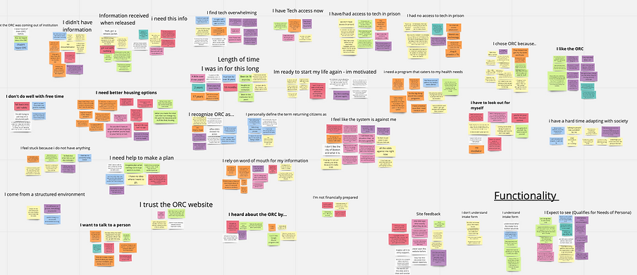
Key insights
"Out there, you need to have someone point you in the right direction. Need to figure it out and feel it in order to do it."
"Help me make a plan"
“I came out of prison, and I had no income, no clothes, no, really anything, I was lucky to get on a bus”
"I do not receive any support".
Results
Having limited to no access to technology; making a phone call could be ‘it’ at first
Feeling overwhelmed about adapting to life outside of an institution, many with no support system
to help them get back on their feet
Knowing they need to come up with a plan to keep them from going back to an institution, but with
no means to resources
Hearing about the ORC through word-of-mouth only after they were released, users often came out of incarceration with no knowledge of programs to help them with their needs.

After synthesizing all the data and user insights from "otter" app to documents on googles and we also used a web program called "miro" to be able to simultaneously work as a team on an affinity map to isolate common pain points and patterns using the "I statements to each theme".
Personas
Following our research we compiled the interviews and visualized the user insights collected into persona’s. Our research showed there were two personas.

The first one and main persona is called Omar, who was incarcerated for fifteen years and had little technology knowledge.

Our secondary persona, Grace was incarcerated for a much shorter period than Omar and understood technology a bit better.
We created a journey map to help visualize our users thoughts, feelings and actions, from leaving the institution to arriving at the ORC.
Journey Map
Solution
Our team came up with two recommendations to present to the client.
Recomendation I
Redesign of the ORC web page
Redesigned the Department of Returning Citizens homepage to improve usability,
functionality, and simplicity for citizens
being reintroduced from incarceration.
Recomendation II
Create a paper pamphlet
The paper pamphlet to be handed out to our users as part of their pre-release process in the institutions or to their families, this
addresses their primary challenge of
limited access to technology
We decided along with the Boston Digital Team, that our primary efforts would be best spent
on the redesign of the web page. As a caveat, we later designed a pamphlet to help the
print department in future endeavors.

Site Map
Moving into the design phase, I created the site map for the home page of the ORC with the intention of keeping it simple, but informative

User Flow
Ties into the primary needs of our user, find out
the services the ORC has to offer, team page, staff,
contact information and the steps needed to get
started with the ORC
PHASE II
Designing For the User
We did a design studio to brainstorm possible layouts for our wireframes.
Once completed, we selected common elements and merged them into one sketch.

Lo-Fi Wireframe & Iterations for the webpage


"Who we are" was found confusing and irrelevant to users at this point and was removed.
"Book an appointment" was changed to "Getting Started", it caused expectations that users could book an online appointment
Changed steps from five to three as users were overwhelmed
Users thought this red section was a separate area and either scrolled past or did not connect with above
Added space between lines, and
"BOOK APPOINTMENT"button changed to "Get Started" and moved to left
Developing a wireframe prototype was the first step in the process to really allow us to gain a visual of what the content and layout would look like allowing better user feedback from usability testing.
Wireframes
Conducted usability tests throught the process with our paper prototype and wireframes to determine the ease of use and root of any confusion amoung screen flows.
Usability Tests
Shown above is a wireframe prototype we tested with users to see what worked and what did not.
Usability Tests
Lo-fi Wireframe for a pamphlet
We did not do usability testing with the pamphlet, but provided this as an initial design. It includes an Intake form that a user can rip off and mail into the ORC. We found in our research, the price of a stamp may be cheaper than a phone call.


CASE STUDY IN CONSTRUCTION
High Fidelity Wireframe for ORC Webpage

Keys Take away
I never thought I would use my corrections officer's training ever again, and on my capstone surprise project there I was, using my CO skills during the interviews, reading through body language, I could understand every single detail even when they did not say much, I saw my past career merging into the new one right before my eyes and I could have not had a better project to make me understand what I want to do for the rest of my life. Working with The Department of Returning Citizens was rewarding, being able to make a change to benefit the users needs is why I decided to design.
I wish I had more time to do another round of usability testing on the webpage, and see the results with the pamphlet as well.
I learned a lot about myself with this project and especially how valuable technology is and when you don’t have it or don’t know how to use it, you are automatically at a disadvantage. In reality, how impactful is a web design if your users can't even reach it.
